Monday 31 January 2011

Our Poster Production Process


To create a graphic image of a needle going through a tongue we initially captured photographs of our model's mouth whilst pushing her tongue out with a pen:


Secondly, I cut out the pen from the image using the lasso tool on photoshop which will further be replaced by our 'needle'

To make her look a bit more 'dead' I used the 'sponge tool' to desaturate the picture and thus using the 'burn tool' on her tongue to give a more 'scabbed' or 'pierced' effect:

To add in the needle we searched for an image of a needle containing blood (to link it to our narrative) and placed it on our image. By cutting out the image using the 'lasso tool' I placed it onto the image of the tongue whilst erasing certain elements to portray the illusion that the needle is penetrating the tongue. We also thoughr that adding some type of brusing will add to the dramatic effect we were aiming to give out on this image, I accomplished this by using the 'burn tool' on her skin.
The Syringe
To finalise and add the theme of blood and horror into the image we decided that adding extra blood underneath the tongue will add to the gore and most likely shock the audience even more and generate a better reaction thus drawing them to the poster. We added the blood by searching google for a 'blood drip' and then pasted it into the mouth of our 'victim'.

Our Blood Dripping Effect
This process more or less completes the majority of the manipulation needed for our main image which is to be used on our poster. It is the main feature, which is what we initally want our audience to see and what will be used to draw them to see the rest of the poster and watch the film. 


When placing our image onto the main template of our marketing poster we decided to adjust the brightness and contrast of the image, making the models skin seem much paler which not only symbolises our theme of purity but it also makes it look as if she has the complexion of a dead character which links to the horror theme.

We primarily decided to place our main image at the bottom of our poster, which then challenges conventions in itself as many current horror posters I have studied mainly have their image or main actor at the top or in the middle. Here was our first inital design:


We placed the film information including the REDEMPTION logo etc. to make it look as if they were the facial features of our victim. After getting it reviewed by our media teachers and other pupils we felt as if it challenges the conventions of horror posters to a too greater extent and we believed that it would look more professional if we were to have the image at the top of the page, which lead to the production of our final poster: 

 
I feel that the shocking image above will really grab the audiences attention. The fact that it is the 'victim's tongue may relate to sensitivity as it is a very personal part of the body plus it is seems to be a very painful image. I feel that the blood stands out against the dirty white background. The fact that the blood is not bright red can portray the 'disease' or 'impurity' of Balthazar's blood or that it has been contained for some time. Our main colour is white-which symbolises 'purification'. Our film is rated 18 as there are graphic scenes of blood and gore, sexual scenes and extreme violence and language (very similar to those from 'SAW' which is also rated 18). We have included a website linked to our film which can also help to market our production using new media technology. We have also decided to include a quotation from Empire Magazine, which is also displayed in our trailer, thus linking these two types of media together. 'The Next Stop Is Purification' is our tagline. 'The Next Stop' represents the trains and train stations in our narrative as this is where the film is set.  


This is our logo for REDEMPTION, our font is called disturbed and we feel that is almost has a stamp-like effect or a hot branding iron effect. We used the same dirty red with splashes of brighter red. It almost looks like a wound that has scabbed over (Balthazar inflicted wounds) and I feel that the different sized letters create a more corrupted effect. 

Overall I feel that our poster looks very professional and hints at the plot to an extent where it is not given away completely. I feel that by not using the conventional 'black and red' colour palette we stand out against other horror films which may be a reason that would draw our audience to watch our movie. 

Friday 28 January 2011

Adjustment Of Our Teaser Trailer


After various research and review, we noticed that one element within our trailer would not incorporate or have a conventional link between our two ancillary texts. As we were planning on having a 'pure white' colour palette theme within our poster and magazine cover, we feel that the ending of our trailer needed to also have this to help the audience recognise and establish our film just by looking at the end logo of 'REDEMPTION' rather than the white on black logo. 

Inspiration

For our horror poster, we all felt very drawn to a pale, pure colour palette to reflect the 'purification' element in our narrative. Current horror posters that inspire us are those from the 'SAW' series, they have a very sterilized look with the vibrant contrast of blood to emphasise this mise-en-scene. Here are a few examples:


Furthermore, the whole narrative of SAW reflects our own as 'Jigsaw' captures immoral victims and tries to teach them morality. Plus, I feel that these images shock the viewer and leave them effected by the imagery. I may make them feel uncomfortable and I feel that we should reflect this and leave an effect on our target audience.


Also, whilst browsing google for images concerning needles and blood we came across this image:


The needle in this image yet again reflects our narrative as Balthazar injects his victims with blood. We will try to recreate this image for our poster.

Wednesday 26 January 2011

Current Horror Posters


Here are examples of current and past horror posters, I can see that the main colour palettes used in these posters are very dull with the vibrant red that stands out and emphasises important elements within the poster. I feel very inspired by these posters and look forward to creating our own. 

Tuesday 25 January 2011

Film Poster Analysis

To enhance my knowledge on the conventions and messages portrayed in the posters for horror films I annotated in depth all the elements of two past horror posters:


Friday 21 January 2011

Editing Overview And Final Trailer Product

Well today we finished editing our horror teaser trailer. It was a challanging but enjoyable experience and I feel considerably happy with our outcome. We have now uploaded our trailer on YouTube and we are awaiting the beginning of our audience response. I feel that the editing process was very time consuming but I feel that the more time I spent using the editing programme Adobe Premiere Pro I became more familiar with the effects and transitions that could make our trailer look more professional and realistic. I have learnt a lot creating our trailer and I now appreciate the innovative  ideas and skills that the media professionals of the film world withhold to constantly produce and distribute this type of media.
Here is our YouTube Link (slightly better quality) http://www.youtube.com/watch?v=LWz63uzmIdE
And here is our final product! :  


enjoy :) 

Wednesday 19 January 2011

Other Elements Within Our Trailer And Screen Captures

By doing further research on the conventions of horror trailers our group felt that we should incorporate our own tag lines and a synopsis to add realism to our trailer and follow what other successful trailers have included to have a better effect on the audience. Here are examples of the ones that we plan to use along with shots within our trailer: 


Tuesday 18 January 2011

Music And SFX

What myself and my group felt really made a trailer effective and in this case related to the horror genre, was the soundtrack and sound effects that we would use to assist our current shots. These would help to bring each sequence together and create suspension between scenes and shots. I can also help to narrate the trailer and assist in giving the audience an idea about the plot. By doing some research, we recognised that each horror film had its own 'iconic soundtrack' for example the famous 'Psycho' and 'Halloween' soundtracks below;


Along with iconic characters and plot lines, these two films are also very well recognised by their soundtracks, which are not only used throughout their trailers but within the whole film as well. We wanted to imitate this convention and find a sound track for 'REDEMPTION'. We wanted to go for a 'indie' or 'grungy' effect, which challenges many conventions for horror trailers as they usually tend to go for strings and synths etc. We also wanted there to be a constant base sound which can reflect the rhythm of a train etc. Here were a couple bands and artists that we considered using for our soundtrack:

  • Placebo 
  • Marilyn Manson
  • The Killers 
  • MUSE
  • Bat for Lashes 
  • Vampire Weekend
  • Radiohead
  • Kings Of Leon
Here is our final decision:


As you can hear, there is a constant base throughout, and we feel as if his voice is not too strong and is very atmospheric which is good for our genre. Furthermore, we want to aim at the younger generation and finding a soundtrack with an actual artist who is constantly producing new media, who they may already be familiar with can attract them to our film.

Our sound effects:
To try and add elements of horror into our trailer and make out audience 'jump' we decided to use many bangs and smashes alongside an eerie 'mysterious noise'.

Recipe For A Conventional Horror Teaser Trailer

For personal research, And as we have now initiated the editing process, I wanted to investigate the typical conventions of a realistic, atmospheric and scary Teaser Trailer. I will be analysing 'The Omen (2006)' s Teaser Trailer below;


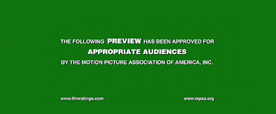
Step 1: ADD A GREEN BAND


By adding a green band at the beginning of our trailer we will be adding a sense of realism and professionalism into our trailer. This is also a convention for film companies to use a green band when promoting their trailers or getting audience feedback.

Here is our green band
Step 2: ADD YOUR PRODUCTION COMPANY LOGO OR NAME
20th Century Fox Production logo/animation
By adding your individual production company name alongside an animation or sound effect is seen in almost every film trailer or teaser trailer. It identifies who produced the film and can be used to build a reputation within their target audience or audiences in general.

Step 3: ADD AN ESTABLISHING SHOT(S)


As you can see 'The Omen' used a creepy, empty, lakeside, playgound scene with the quiet but eerie sound effect of a creaky swing. I feel this is very effective as it creates an uneasy tension-filled atmosphere. It also looks like they have added a slight grey filter and overtone as the shot looks quite discoloured, it is a really good technique in making a normal mirror the atmosphere and feeling of the story. This shot pans across to the figure on the swing.

Step 4: FOCUS ON AN ACTOR/ACTRESS/OBJECT


As the shot progresses we slowy zoom in from behind. It alsmost looks like a point of view shot as it can be seen as walking towards the character. The music slowly develops and increases in volume which adds to the tension and horror within the trailer. Futhermore, as the camera zooms in to that one character, the audience then assume that this is the main or one of the main characters.

Step 5: A JUMP/MOMENT OF HORROR/TENSION


At this point the music changes and I feel that the genre of this film is more obvious to be of the horror genre. Plus, the character is wearing red, which can represent evil and/or blood. The characters stare is aimed directly at the audience which can be seen as a point of view shot. It is very effective.

Step 6: ADD AN INTERESTING SYNOPSIS


Along with sound effects, 'The Omen' used this very effective Synopsis including the element '666' which of course represents the devil or evil. This is supported when they display 'His Day Will Come' which may indicate the devils return to Earth? Adding a Synopsis can be one of the main elements can can attract audiences to watch your final film as it only hints at the plotline without giving too much away.

Step 7: ADD A FANCY DATE OF RELEASE


I feel that they used a really good idea of releasing their film on the 6th of June 2006 (06.06.06) which they yet again linked to the devil or devilish image. They also made this clear by fading the first image into the second. I really like what they did here and was a innovative way to attract their audience once more.
By studying this one trailer in detail I feel as if I have beomce more popular and aware of the conventions of a horror trailer which I can then transfer into the production of our own trailer.