Thursday 17 February 2011

Evaluation-Prezi


Friday 11 February 2011

Data From Our Questionnaire

Here are some of the results from the questionnaire we conducted: 


Overall I feel that we had really good audience response to our main and ancillary texts. I am confident that we have catered to our target audience like we planned and it seems as if all of our hard work has paid off.  

Wednesday 9 February 2011

Further Audience Feedback

As well as gathering audience feedback from our questionnaire, I had uploaded our teaser trailer onto my YouTube account, as well as linking this to my Facebook and Tumblr pages. I also uploaded a copy of our marketing poster onto my Facebook account. This created popularity for our production before the official premiere, which had made the public aware of our production team and our film as well as our actors etc. It gave us initial audience feedback before finalising any of our editing processes. 


HTML for our YouTube upload: http://www.youtube.com/watch?v=LWz63uzmIdE


As you can see we received very positive feedback, which supports the fact that we had provided our audience with what they liked to see and what they believed to be 'professional' and that we successfully met our 'brief'.

Questionnaire

To receive some quantitative data about our target audience response, we conducted a questionnaire in which we distributed amongst our audience when screening our teaser trailer and displaying our horror poster and magazine front cover:


From creating this questionnaire, we will receive feedback from our target audience, stating the favorite elements withing our three productions and what we could have improved on. This in a way tests all the hard work we have put into creating our final products and proves whether we have used the appropriate conventions that are recognisable to the public to make our elements 'professional' in their eyes.

Presentation For Our First Group Audience

Today we presented our magazine front cover, poster and teaser trailer to members of our college and teachers from a variety of age groups. To establish our group as a production company and formally display our poster and magazine cover and explain our ideas behind it. We used a power point presentation to market REDEMPTION in front of our audience:


Displaying our horror poster.
Displaying the steps we undertook, and inspiration that created our REDEMPTION poster.
Marketing-displaying places where our poster would be placed-At a bus station or stop.
Marketing-displaying places where our poster would be placed-Roadside billboards.
Marketing-displaying places where our poster would be placed-On a bus.
Examples of previous and current film magazine front covers.
Displaying our front cover for Empire, plus showing actors.
Revealing the plot to the audience so they can relate to this when watching the trailer.
Summary of our production process.
This was a really challenging and unique experience for me. It was the first time that I had to present my work in front of audience members who i was unfamiliar with. It was also very interesting to finally see the audiences reaction to our media and to see all our hard work finally paying of and coming together. I also found this experience to be nerve wracking, as I was unsure of whether they would be impressed, or would misunderstand the plot and effect that we were aiming to give out. I am looking forward to our audience feedback.   

Advertising Our Trailer Premier-Invitation

To gain some extra response for our poster, magazine cover and trailer as a group of media, along with other groups, planned a 'Premier' for a private viewing of all three of our productions. To advertise this event and make the public more aware of our film etc. we had to create invitations that we would personally hand to chosen audience members and to display around the college:


We decided to manipulate our current poster, which would help the public to be familiar with and identify our film and create a reputation, or help to spread the word about our film. By making all the key information bright red and in bold, capital letters, this will stand out and hopefully catch the eyes of our target audience (as well as red being part of our colour palette and blood) . I feel that giving the public a sneak peek into our poster, which then refers to the whole narrative and plot of our film, will help them to familiarise themselves with LOCKED PRODUCTIONS and REDEMPTION and hopefully create enough intrigue to make them want to watch our film.  

Tuesday 8 February 2011

Magazine Front Cover Analysis

Magazine Cover Colour Palette


Here is the colour palette featuring all the colours that we used on our front cover. We chose the conventional horror colours black and red/maroon to be a part of our main colour theme to represent the theme and genre of the movie and of course, red portrays the bloodshed in the production. We felt that by adding the gold would incorporate and represent the exclusive 'horror review special' edition of the magazine and can attract Empire collectors into buying this magazine and then therefore watching our film. We decided to change the colour of the font according to the background colour so that visibility is at a good quality for the reader, plus highlighting or underline important elements that we feel should be noticed. We challenged conventions to a point where we used a grey scale image but we have researched and displayed that this has happened before, so we may be supporting the development of this particular convention. I feel that by sticking to only a few colours with black and white, creates a sense of professionalism and doesn't overwhelm the reader with too many elements and colours. 

Monday 7 February 2011

Our Magazine Cover Production Process


Here are various steps that we took out to create our final magazine cover:

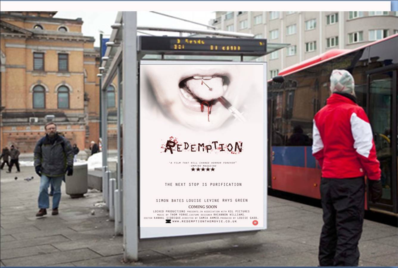
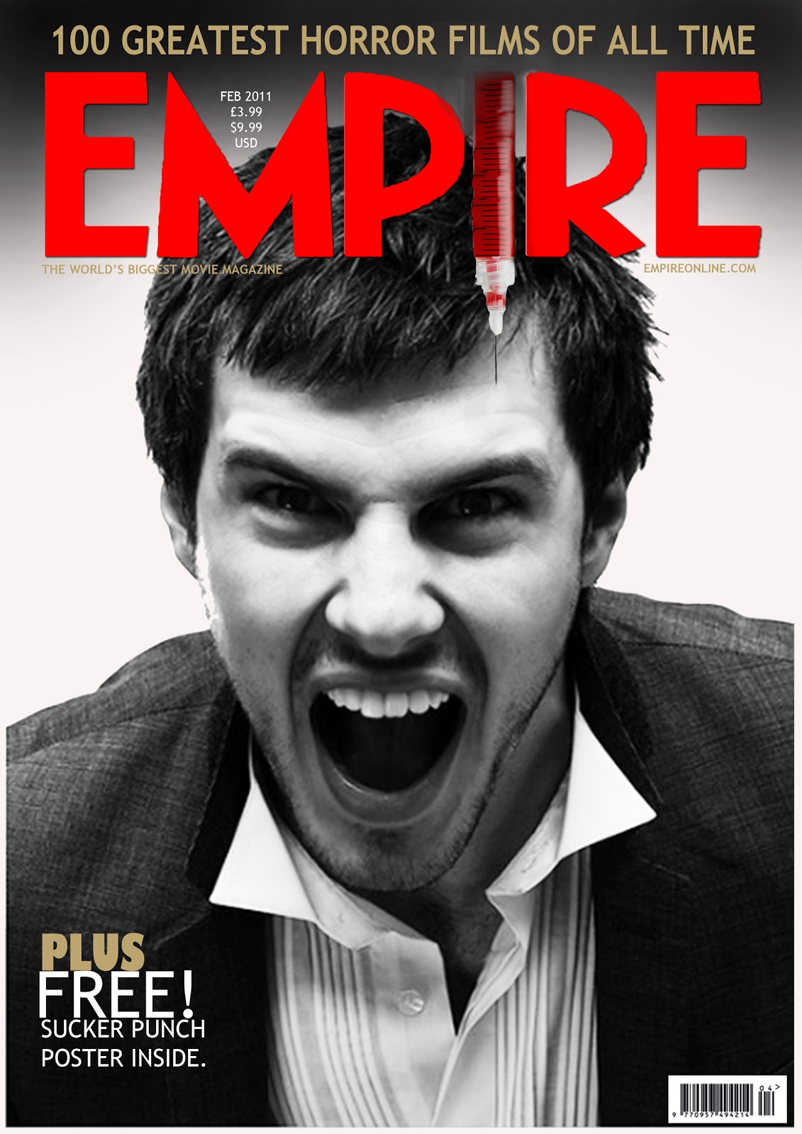
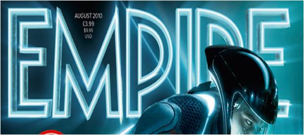
Here are the main elements that we built on to create our final magazine cover. By adding conventional elements to the magazine such as a barcode, price and date makes the cover look more professional and realistic. For the 'Empire' masthead we thought that incorporating the syringe would further help to link both our trailer and poster to the magazine cover. It also seems to develop the typical convention of the 'Empire' masthead, but with previous research I realised that many other films tend to manipulate this element: e.g. Tron Legacy:


We decided to chose the image of our main actor screaming, this reflects the open mouth  in our poster. I also feel that is is a modern day response to the image of Norman Bates in the iconic 'Psycho' by Alfred Hitchcock:

Norman Bates


As you can see we have imitated the black and white image and the actors glare is straight at the reader. I believe that not many Empire issues use a greyscale image on the front cover so this can be a way in which we are challenging conventions. We have also incorporated "INTRODUCING THE NEW NORMAN BATES OF HORROR" to help the reader identify this.

After some consideration, we decided to make our issue a 'special collectors edition' and used a colour palette involving a goldish colour to symbolise this along with the banner at the top stating '100 GREATEST HORROR FILMS OF ALL TIME'; as our film is of the horror genre I believe that whoever is interested in our film, will more than likely be interested in reading into other films from the same genre. We also added the same Logo for REDEMPTION alongside our tagline, which yet again links our poster and trailer to our magazine. We had to adjust the colour to suit the dark background, but by using the same font, the public should be able to identify us.


Here is our final magazine cover. We have developed our previous design by aligning our various plugs and pull quotes and by adding a 'sticker' stating that the magazine is a 'HORROR REVIEW SPECIAL'. We have tried to attract readers by including a free poster and other exclusive interviews and reviews, plus adding in a pull quote of the review 'Empire' has given to our film, which should indicate that it is worth watching. I feel that our magazine cover looks very professional and i feel that we have followed typical conventions.


Our main inspiration for our magazine cover was the issue on Heath Ledger:


As you can see the image is greyscale, but this should not have any effect on sales as 'Empire' already has an established reputation. The cover in itself is quite plain but as this is a tribute to a late actor I feel that this is enough to sell the magazine. I believe that we needed plugs and pull quotes as our actor is not established and we would need these to further support our film and help sell the magazine.

Friday 4 February 2011

Final Images For Our Magazine Cover

We have now decided to use our main villain actor-Ryce Morgan who plays 'Balthazar' to be featured on the front cover of our magazine. We feel that as he is shown much more on our trailer than our final girl we should feature him as the main aspect of our film regarding what the public would see in the trailer. Here are the images we have to chose from:


Wednesday 2 February 2011

Empire Magazine Front Cover Analysis

Here I have attempted to recognise the conventions of an Empire Magazine front cover so as to make the process of creating our own much easier and to also make it look more professional:


Mock Magazine Cover Photoshoot

We feel that portraying our final girl as a powerful, intimidating yet feminine and sensual character can bring a new style of convention to the stereotypical image of the final girl. We decided to use the image of our final girl as the main feature on our magazine cover, but as the actress, not necessarily in character . We found a couple of images that we would like to recreate in our own production:


As you can see their gaze is directly at the reader and it somewhat intimidating and powerful as well as attractive. The photographer has used a mid-close up/close up shot of the actress's focusing on the face. I feel this would be a good way to attract male audiences as well as female. The Total film magazine above displays the actress clenching her fists which is yet again a powerful image. It challenges the stereotypical views on women as they seem to be very dominantly displayed in both magazine covers.  

Here is a Mock of the style that we tried to re-create:


As you can see the final girl looks completely out of character and looks quite serious and intimidating. The prop has nothing to do with our plot, but we were just experimenting with different shots and props etc. The glasses do block her gaze but we assume that she is looking straight at the audience. Furthermore, the colour palette of this photograph reflects that of our poster, with the white background with red. 

Tuesday 1 February 2011

Magazine Covers Research


As our horror film is to be marketed and featured on a major distributed film magazine, we felt that we would need to follow conventions of well known magazines to make our own front cover look professional and attractive. We personally feel that Empire Magazine would suit our film over Total Film even though they both feature mainstream films, research states that Empire continue to outsell Total Film magazine so I believe that our target audience are more likely going to by Empire over Total Film as it is widely distributed and advertised. We also like the idea of there being a transcript of REDEMPTION available to up and coming fans and film fanatics. Furthermore, Empire is distributed worldwide which I feel would be a good feature that can market our film to different cultures as well as audiences. I also like the idea of a 'spine quote' which could possibly be our tagline. We will now process into creating our own magazine cover.